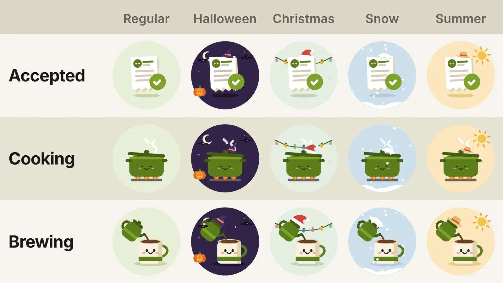
A customer who has just paid for an order wants one thing: to know what happens next. A clear status answers that before they open the support chat. That is why every order state deserves its own picture.
I drew a set for a food ordering product I’m working on. 8 statuses run from Accepted to Delivered, with Cooking, Brewing for coffee orders, and a sad cup for Canceled. Each one is a short Lottie loop of 2-3 seconds that plays on the web, in the customer app and in the courier app.
The small touch I like most is context. The same status changes its look with the season: Regular, Halloween, Christmas, Snow and Summer. 8 statuses in 5 themes give 40 animations.
How does the app pick a theme?
- The date in the restaurant’s timezone decides the season.
- Christmas wins over Snow when both apply.
- Outside every range, the Regular theme plays.
The season is a layer on top of the base scene. The main object gets a hat, and the background gets its decorations: bats and a pumpkin, string lights, snowfall, the sun. The scene itself stays the same, so a new theme costs one set of layers.
Where else can context come from?
- The user: a birthday, a favorite dish, the language they read in.
- The location: the weather in the city, a local holiday.
- The place: a coffee shop gets Brewing, a pizzeria gets its oven.
Customers rarely look at a status screen when it simply works. They remember the one that smiled back at them on Halloween.
Cheers!